Fields and forms
This documentation will cover some of the more technical aspects of the forms, but please visit our Form Style Guide for guidance on writing effective forms.
Field types
This page documents the general guidelines that apply to most form field types. Pick from our form fields selection below for information around a specific field type.
Form field structure
Form field layout
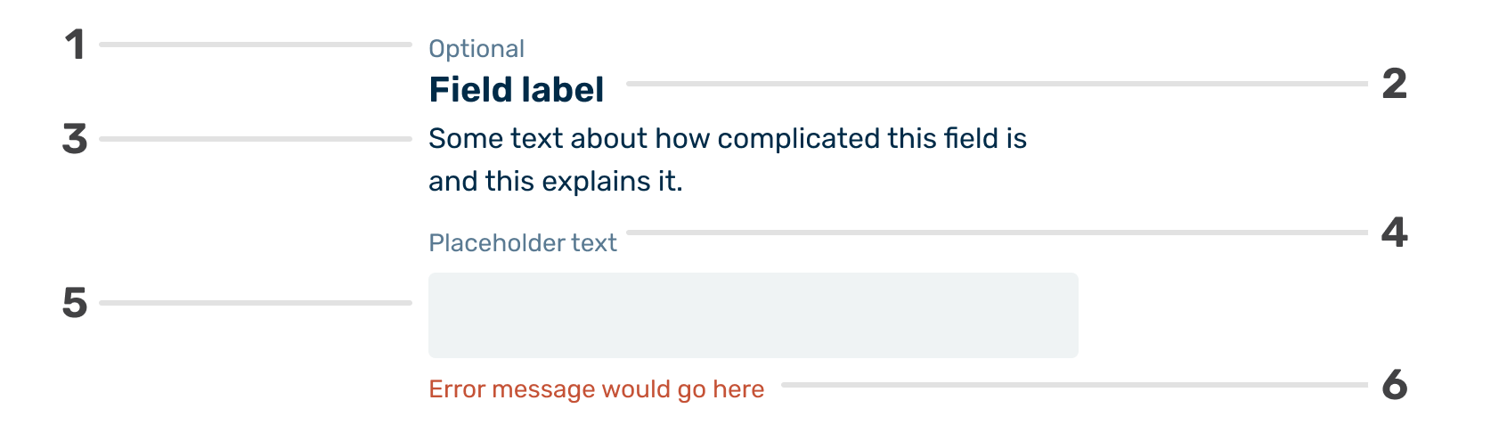
Optional label
Many web forms indicate required fields with red text ("required") or asterisks ("*"). We’ve decided to take a slightly different route when distinguishing between required and optional fields.
Most of our forms have more required fields than optional ones. This leads to a series of red asterisks (*) next to most fields. While pretty universal on forms, the asterisk next to the field label is not universally understood and can lead to confusion. If the intent of the asterisk is not understood, the user will have to find your footnote describing its use and then navigate back to their place.
The repeated use of a red asterisk also adds unnecessary visual noise to an interface that benefits from having the least visual noise possible.
Field name
The field name should be as specific as possible and as brief as possible. We have the field description and placeholder text to add more context to the field if needed.
Field description
Use the field description when required to add context to the form field beyond what the field label provides.
Two guiding principles with the field description are:
- There isn’t a need to use it with every field. If the field name is clear and a concept that doesn’t require further explanation, like “first name,” skip it.
- Keep it as brief as possible without degrading the message.
Placeholder text
Our implementation of the placeholder text is somewhat different from most. We place the placeholder text outside the field instead of within the field. This placement enhances the field’s accessibility by having it always visible and makes it easier for screen readers to access since placeholder text is not universally supported.
Some guidelines for placeholder text are:
- Use sparingly. No placeholder is needed if the field name is clear and doesn’t require further explanation (e.g. “First name”).
- But be thoughtful about its use. Suppose your audience represents a sizeable immigrant population, for example. In that case, it may be helpful to add “Your surname or family name” as placeholder text for a “last name” field
- Keep it short. Placeholder text should not exceed one line.
Field area
In the example above, the field area contains a text field for typed input. The field area in our main configuration could be any interactive form element beyond a text field. Examples of an interactive form element could include a text area, date picker, a series of radio buttons, etc.
Field status message
The status message contains text describing the field's error or success status.
The text should describe the status of an individual field and not the larger form section.
An example would be communicating that the user placed text characters in a date field vs. an automatic lookup that relied on multiple fields and failed to find a result.