Buttons
Use buttons for major actions.
Buttons draw more attention than a simple text link. Because of their larger surface and color, they are visually more findable and easier to click or tap.
When to use
Use a button when an action has more weight or significance. Examples:
- There is a clear primary action people should take
- Highlighting a suggested action in a page section
- A significant or destructive action will be applied and users need to be aware
If the action should not be prompted, a text link may be a better option.
Types of buttons
Primary button
This is the most common type of button. Use these to direct people to a clear primary action. To call out that these buttons are actionable, they are action blue #495ED4.
<button class="btn">
  Do something
</button>
Try not to have more than 1 primary button on a page. Multiple primary buttons puts more cognitive load on people. It takes them more time and effort to figure out what to do.
Inverse button
On some backgrounds, the primary button color will not have sufficient contrast. In this case, use inverse buttons, which have a white fill.
Code editor
Secondary button
Code editor
Secondary buttons don’t have as much visual weight because they are outlined instead of solid. Use these if your button is not an important action on the page.
Pair it side-by-side with a primary button to prompt toward the primary button’s action.
Code editor
Variations
Block buttons
Block buttons stretch to fill the width of the screen or area instead of having a set width. They are often used on mobile layouts.
Code editor
Icons
Icons can be on the left or right of the text in a button. Do not use more than one icon in a button.
Code editor
Icons should reinforce the meaning of the button’s text. In rare cases, an icon can be used without text. Only do this if the icon is extremely universally understood, such as an arrow or search magnifying glass. Read more about icons
Appearance
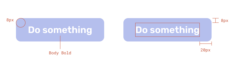
Buttons have:
- corner radius of 8px
- 8px padding on the top and bottom
- 20px padding left and right, but can be variable on block buttons
- Body Bold text
Usage
Alignment
Buttons are typically left aligned with other content, not centered. For exceptions, see block buttons.
Be a DreamSF Fellow
The DreamSF Fellowship is a paid leadership and civic engagement program for immigrant youth.
- Button is left aligned with other content
Be a DreamSF Fellow
The DreamSF Fellowship is a paid leadership and civic engagement program for immigrant youth.
- Button is centered
Arrangement of multiple buttons
For 2 or more button options, place them side by side instead of on top of one another if possible. This reduces the chance of accidentally clicking the wrong one and avoids alignment issues.
- Choices are side by side
- Choices are stacked
Writing button text
Button text should ideally be less than 15 characters. A maximum of 25 characters is OK if necessary.
Refer to the button text library for common button uses.
Long button text is less legible, less impactful, and sometimes can even cause wrapping.
- Button text is short
- Button text is very long
- Button text fits on one line
- Button text wraps to fit
HTML implementation
Buttons styles can be applied to both HTML links (<a> elements) and interactive buttons (<button>).